Oracle Analytics
Column Swapping in Oracle Analytics: A Useful Enhancement in the March 2026 Update
IntroductionOracle Analytics updates often include small usability improvements that can significantly enhance how users interact with dashboards. While major capabilities such as AI agents tend to attract the most…
Introduction
Oracle Analytics updates often include small usability improvements that can significantly enhance how users interact with dashboards. While major capabilities such as AI agents tend to attract the most attention, incremental enhancements to data exploration can have an equally meaningful impact on day-to-day analytics workflows.
Long-time Oracle analytics users may remember the Column Selector feature in Oracle Business Intelligence Enterprise Edition (OBIEE). This capability allowed dashboard authors to define a set of columns that users could switch between dynamically. Instead of creating multiple charts or tables for different metrics, consumers could simply toggle between the available columns within a single visualisation.
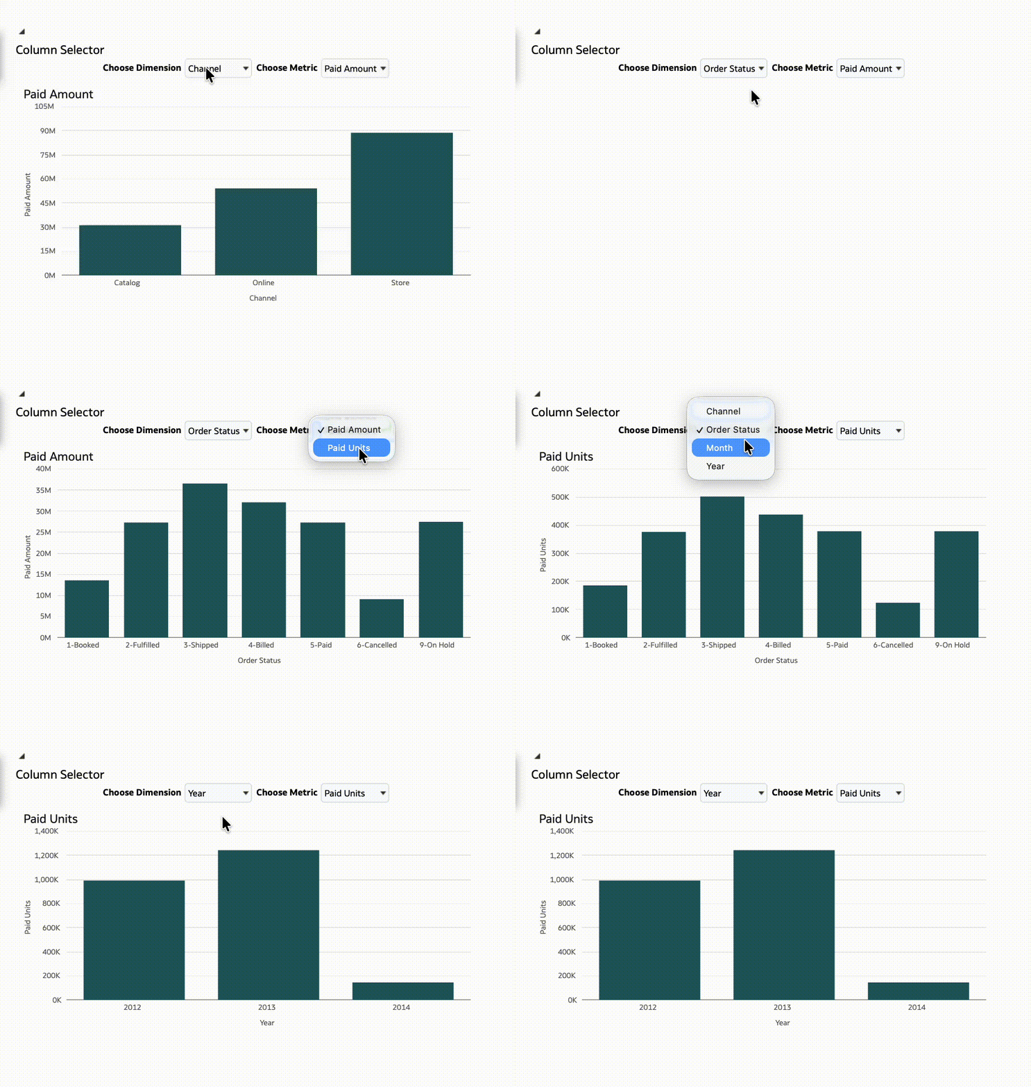
This approach made dashboards far more flexible while keeping their design simple and manageable.
The March 2026 Oracle Analytics update introduces new capabilities that follow a similar principle. Users can now swap the columns used in overlay charts and map legends, allowing consumers to explore different perspectives of the data directly within a visualisation.
While these features may appear small at first glance, they represent an important step towards more interactive and exploratory analytics experiences.
Column Swapping in Visualisations
One of the key themes in the March 2026 update is enabling consumers to change the data being visualised without requiring modifications to the underlying analysis.
By allowing columns to be swapped directly within visualisations, Oracle Analytics enables dashboard designers to create fewer but more flexible charts. Consumers can then adjust the metrics or dimensions being displayed based on the analytical perspective they want to explore.
Two particularly useful examples of this capability are found in overlay charts and map visualisations.
Swapping Columns in Overlay Charts
Overlay charts allow multiple visualisation layers to be combined within a single chart. A common example is a bar chart showing one metric while a line overlay represents another measure.
For example, a visualisation might display:
- Revenue by month as bars
- Profit as a line overlay
Previously, the columns used for the axis and overlay layers were fixed once the visualisation was created. If users wanted to compare different metrics, dashboard authors often needed to create additional visualisations or redesign the chart.
With the March 2026 update, Oracle Analytics now allows users to swap the columns used in an overlay chart’s axis and legend labels directly within the visualisation.
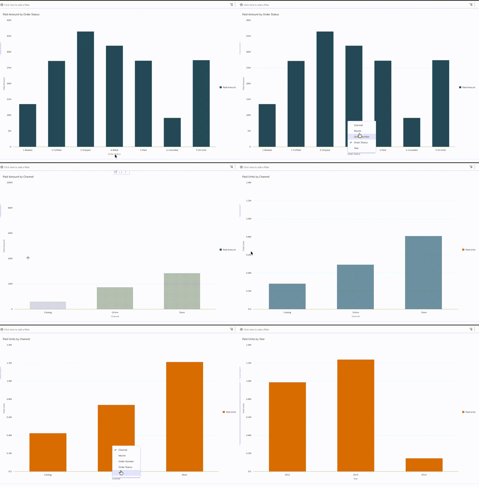
This means consumers can dynamically switch the metrics being compared. For example, the same chart could easily be used to explore:
- Revenue and profit
- Profit and margin
- Invoice amount and revenue
This capability significantly improves analytical flexibility while avoiding the need to duplicate charts for every metric combination.
Swapping Columns for Map Legends
A similar capability has also been introduced for map visualisations.
Maps commonly use colour legends to represent a business metric across geographic regions. For example, a map might highlight regions based on revenue performance or customer counts.
Previously, the metric used in the legend was fixed when the visualisation was designed. If users wanted to view the map using a different measure, authors typically needed to create separate map visualisations.
With the March 2026 update, Oracle Analytics now supports swapping the column used in map visualisation legends. Consumers can change the metric represented in the legend without modifying the underlying analysis.
For example, a single map could allow users to switch between:
- Margin Percent by Country
- Revenue by Country
- Number of Customers by Region
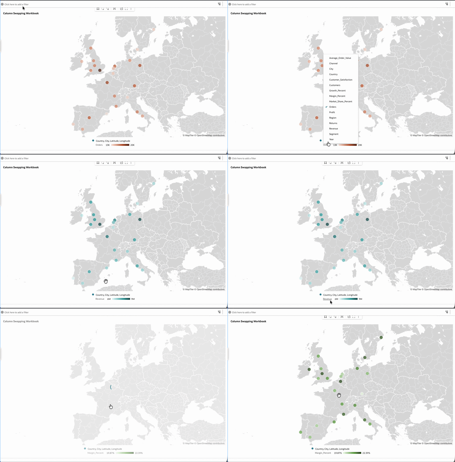
This provides a more flexible way to explore geographic performance while keeping dashboards simpler and easier to maintain.
Why This Matters for Dashboard Design
Although these enhancements may appear minor compared to larger platform features, they have important implications for dashboard design.
Traditionally, dashboard authors often needed to create multiple versions of the same chart in order to support different analytical perspectives. This could lead to crowded dashboards containing many similar visualisations that differed only by the metric being displayed.
By enabling columns to be swapped directly within visualisations, Oracle Analytics allows authors to design fewer but more flexible dashboards. Consumers can then explore the data more freely without requiring additional dashboard elements.
This approach offers several benefits:
- dashboards remain cleaner and easier to navigate
- fewer duplicate visualisations need to be maintained
- consumers can explore multiple analytical perspectives within a single chart
In many ways, these capabilities bring back a familiar concept from OBIEE’s column selector feature, but applied to modern visualisations in Oracle Analytics.
Conclusion
While large platform capabilities often dominate release announcements, improvements to usability and exploration can have an equally significant impact on how organisations interact with their data.
The column swapping enhancements introduced in the March 2026 Oracle Analytics update make it easier for consumers to explore data directly within visualisations while allowing dashboard authors to keep designs simpler and more maintainable.
Features such as overlay chart column swapping and map legend swapping may appear small individually, but together they represent another step towards more interactive and user-driven analytics experiences in Oracle Analytics.